Should you use Asana or ClickUp as a designer? Here’s why I made the switch
Let's talk about project management tools, shall we? As a designer, it's important to stay organised and efficient, right? It's the secret sauce to successful design projects. And let me tell you, finding that perfect tool to manage everything can make all the difference.
Now, when I started my business, I jumped on the Asana bandwagon. It did the job, but deep down, I couldn't shake this nagging feeling that I was wasting too much time. I mean, seriously, adding tasks to a daily planning project as a workaround just to keep track of what I needed to do?
It felt like I was caught in a never-ending battle to stay on top of things.
That's when the coach of a program that I was in did a tour of their ClickUp. I was hooked, bought templates and spent an entire weekend migrating my Asana to ClickUp. And it has been a game-changer!
ClickUp opened my eyes to a whole new level of project management possibilities. I finally had a tool that let me shape my workflows and processes to fit my unique needs as a designer. No more feeling overwhelmed by a sea of tasks that needed constant manual attention.
In this blog, I'll share why I made the switch and give you a glimpse of how my project management setup looked in Asana versus what it does now in ClickUp.
I’m breaking this up into three different sections:
My 3 main reasons for looking for an alternative to Asana
3 things that I love about using ClickUp
Practical examples of the difference between Asana and ClickUp
My 3 main reasons for looking for an alternative to Asana
As my design projects started getting more complex, I found myself caught in a never-ending cycle of duplicating tasks, adding them to multiple lists, and adding client tags.
Although Asana have made some improvements since I left, a recent migration project reminded me of the frustrations I had experienced before.
Just a quick side note: I made this switch back when I was still a full-time designer. Now, Asana might have been great for my current coaching packages, which are a bit less complex. But then there are still the business processes I have to manage. So I believe I would still have made the same switch if I had been coaching full-time. There just had to be an easier way to manage my tasks.
Free vs paid plans
One of my major hurdles with Asana was the free versus paid plans dilemma. I tried making do with the free plan, but guess what? I hit limitations left and right and felt like all the features I really needed were locked away, and I couldn't even test them out before committing to a paid plan.
When I moved to ClickUp, they gave me the option to use a big chunk of those paid features, but with some usage limitations. Sneaky, right? But I understand why they do it and it worked on me.
Looking back, I appreciated the transparency. I knew exactly what I was paying for, thanks to the features being included in the free plan of ClickUp.
Asana? Well, they never quite offered that option (at least not back then). It just felt like too big a leap of faith to pay for features without knowing if they'd actually solve my issues.
Project & Task hierarchy
In Asana, the structure revolves around Workspaces, Projects, and Tasks. While Workspaces can separate different areas of work as it was just me, it did not make sense to create more than 1 workspace.
As the next layer in the hierarchy is Projects, I ended up with over 15 projects. The inability to cluster related projects made it really difficult to manage. Asana introduced their Portfolio feature later, but guess what? Yep, it's on a paid plan.
When it comes to subtask structure, Asana does offer multiple layers of subtasks, which I found quite useful. But as you're not able to collapse tasks beyond the first level of subtasks, this setup often resulted in tasks that would get lost.
Too much manual work to plan my days
Another pain point I encountered with Asana was the manual work required to plan my days effectively. The interface focused more on individual tasks and their details, rather than providing that comprehensive bird's-eye view I was looking for.
While Asana provides different project views, they are limited to each individual project, and features like the reporting tool were only available with a paid plan.
The home and my tasks tabs have been slightly improved by now, but it just was not giving me the overview that I needed to keep my design projects on track and know how much work I had ahead of me for each design project.
To work around this, I had to create a makeshift planning board. Columns for the big 3 tasks of the day, upcoming blog posts, client projects, and a parking lot for all those random ideas that never seemed to find a home.
Asana Daily planning Project
It was a jumble of projects, tags, and tasks upon tasks. Sure, it provided some level of overview, but I was scrolling back and forth like crazy just to grasp what needed to be done each day.
And don't even get me started on the manual labour involved in keeping it all in check. Selecting multiple tasks for those added elements? A true exercise in patience.
3 things that I love about using ClickUp
Let's dive into three of the aspects (there are many more) of ClickUp that have captured my heart and enhanced my design experience!
Let's talk about three things that make me love ClickUp. There are even more reasons to love it, but these three really make the difference.
Customisation and flexibility in setup
As a designer, you know that being able to tailor your tools to match your creative vision is key. Notion may have a reputation for its flexibility, but it can also get messy really quickly if you don't have a clear plan in place from the start.
Asana, on the other hand, felt a bit too rigid for my liking.
The level of customisation and the features that ClickUp offers give the perfect balance between flexibility and structure, giving me enough freedom to tailor the tool to my specific needs while providing a strong foundation.
From Workspaces to Spaces, Folders, Lists, and Tasks, ClickUp's hierarchy provides a solid foundation for organising your business.
Workspaces offer a high-level context (most designers only need one of these), while Spaces help you split your workspace based on departments or processes. You can see folders as subcategories for organising your lists. Within Lists, you create Tasks to represent actionable items.
And the best thing? The ability to switch between different views such as List, Board, Calendar, or Gantt chart, with just a click. Each view can be customised to your liking, giving you a fresh perspective on your tasks and projects.
You can find a good example of this here where I show an example of how you can track your revenue in ClickUp vs. in a spreadsheet.
Task Management
In Asana you could have layers upon layers of tasks, but you could not make these additional layers of subtasks visible and therefore it was easy to miss them. But within ClickUp you can determine how many layers you want and all you need to do is click the down arrow to see them. And subtasks can be turned into tasks.
There are so many possibilities within each task with ClickUp's standard setup like:
Time tracking
Checklists (perfect for those smaller elements that don't need their own task)
Image and video attachments
Threaded comments linking to people, tasks, and docs
Assigning comments as tasks
Sending emails
Recording voice and screen shares
Plus, the game-changer for me (this is what made me upgrade) was the use of custom fields. The flexibility this creates to sort projects based on the design phase, track progress by using a dropdown to mark design elements as in progress, on hold and done as well as use checkmarks to display if an element is approved by the client.
Daily Management
ClickUp's dashboards have become my daily go-to. They're where my day begins and ends, giving me a comprehensive overview of the tasks I need to tackle today and what's coming up in the next few days.
It's like having a personal assistant that keeps me organised and focused on what truly matters. I can jot down important notes, keep track of deadlines, and stay on top of my game—all in one place.
I'll be sharing an example of how ClickUp's dashboards have transformed my daily routine in the next section.
Practical examples between Asana and ClickUp
I've got a couple of practical examples that really highlight the differences between Asana and ClickUp. These examples will give you a better idea of why I made the switch and how it has completely transformed my productivity.
Determining daily priorities.
You know that feeling of being busy but not really accomplishing much? Well, as a business owner, it's crucial to distinguish between tasks that bring in immediate revenue from client work and those that contribute to future growth and business-related tasks.
To make the most of your time and avoid getting lost in meaningless tasks, you need a simple and efficient way to identify your top priorities when you sit down at your desk. And no, jotting down to-do's on a list is not enough. I'm sharing more about why I stopped using to-do lists here.
Both Asana and ClickUp offer home screens, but I found them lacking when it came to customisation and providing a comprehensive overview of what needed my attention.
In Asana, you can only see the upcoming seven tasks and have to switch to a different tab to view overdue ones.
Asana Home Screen
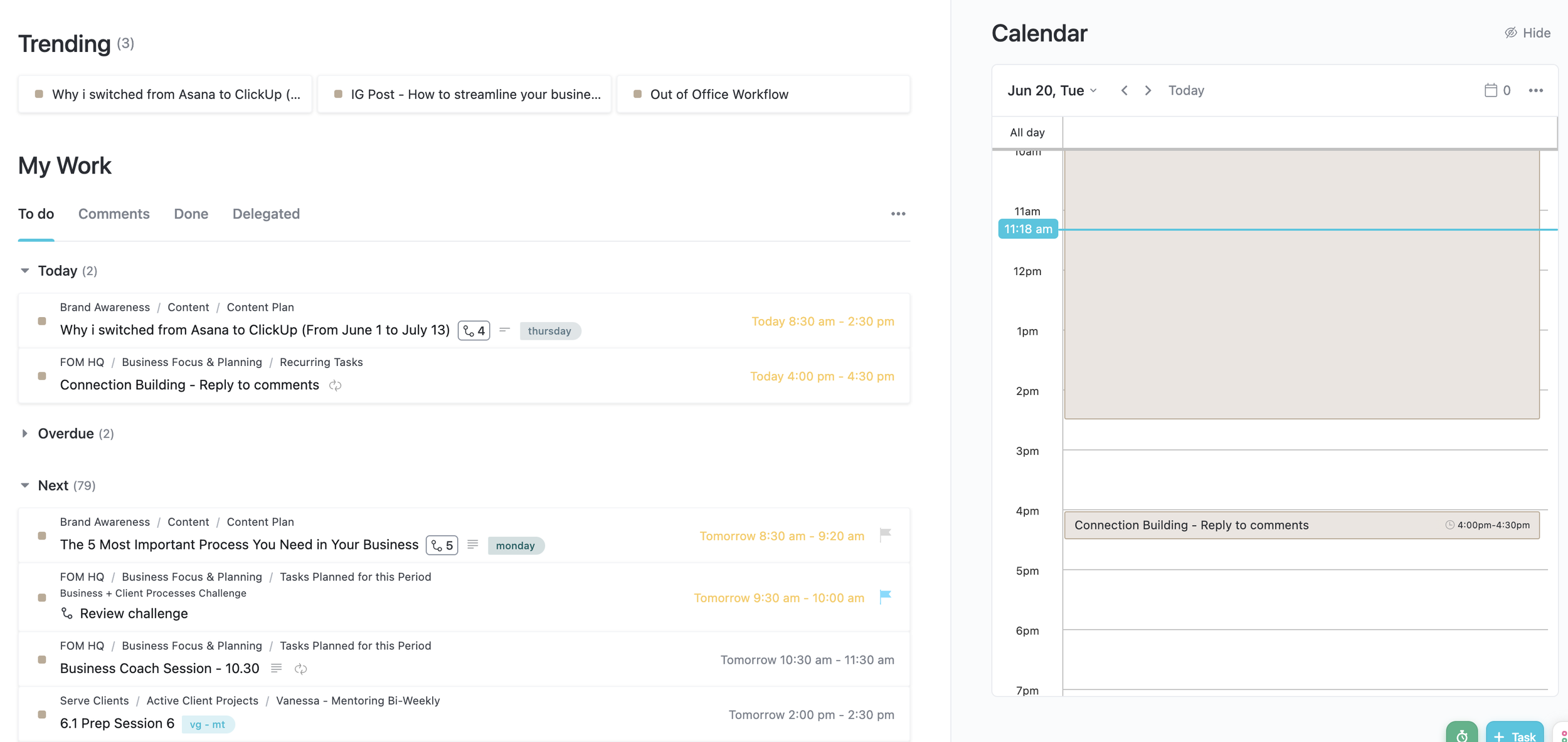
ClickUp, on the other hand, displays tasks due today, overdue tasks, and upcoming ones all in one view. However, I sometimes felt overwhelmed by this view as it felt like an extensive to-do list.
You can see I have 79 tasks at Next, but these 79 tasks have due dates up until September. But when you look at this overview, that's not what you see. It feels like 79 tasks that are all screaming for your attention.
ClickUp Home Screen
The solution?
Enter ClickUp's dashboards! Think of dashboards as a personalised filter for all your tasks. They serve as a centralised hub, eliminating the need to dig through folders and lists to find the most important tasks.
Dashboards offer a single location to access all relevant information, allowing you to stay focused and organised.
And the best part?
You can customise your dashboard to suit your needs, create graphs, or even display time-tracking overviews.
Check out the example below, showcasing a dashboard designed specifically for task overviews. It includes a checklist to start and finish your day (not showing in the screenshot), the middle widget displays tasks due today, and the right widget shows tasks for the next 7 days.
The widgets are automatically updated when a new day starts or when you make adjustments throughout the day for any tasks that have a due date of today or the next 7 days.
ClickUp Daily Dashboard
Whether you use it for all your tasks or make a split to view only client work and business-related tasks separately, the great thing is that you only need to think about the tasks that are showing up in your dashboard.
Not those other 79 tasks that need to happen in the future.
You could even create a dedicated dashboard for each client with links to their contracts, creative briefs, or timelines. Talk about streamlined organisation!
Streamlining design projects
Now let's talk about streamlining design projects. In Asana, I used to create a long list of tasks and use sections to divide them into weeks for effective timeline management. Each subtask had to be manually added to my planning project board to keep track of what I needed to work on.
Asana Design Project
With ClickUp, I could take advantage of the custom fields I mentioned earlier to create a clear timeline and get an at-a-glance overview of the entire project.
The different views in ClickUp allowed me to switch between a list view and a board view. Or have several lists, all filtered to show me different overviews of the same information.
Like:
1. You can see the project organised by phase as in the image below.
You can see by the yellow Focus & Vision tag in the top left-hand (that you also see underneath the phase field) that this project is filtered by design phase.
ClickUp Design Project Template filtered by Design Phase
2. Or see the project organised by the timeline.
You can see by the pink week 1/4 tag in the top left-hand (that you also see underneath the planning field) that this project is filtered by timeline.
It made it so much easier to get a handle on my to-do's!
ClickUp Design Project Template filtered by timeline
Every morning, my dashboard would provide a concise summary of what needed my attention, saving me from having to sift through each client's list. It was a game-changer (not sure how many times I mentioned game-changing by now, but ClickUp try has been for me) in terms of efficiency and time-saving.
Honestly, these examples only scratch the surface of why I'm loving ClickUp and how it has drastically improved my productivity compared to Asana. But here's the thing, whether you choose Asana or embark on the ClickUp adventure, what matters most is finding a project management tool that speaks to you and aligns with how your brain works.
Don't let the steeper learning curve of ClickUp discourage you from exploring its incredible potential.
There you have it…
So there you have it! I hope those examples have given you a clearer picture of why I made the switch and why ClickUp has become my go-to tool for managing projects and boosting my productivity.
But here's the important thing to remember: I'm not here to convince you that ClickUp is the ultimate solution for every designer out there. We all have different preferences and requirements when it comes to project management tools. What I want to do is inspire and support you in making an informed decision that aligns with your unique needs.
By sharing my reasons for switching from Asana to ClickUp and providing those practical examples, I hope I've given you some valuable insights that will help you make the right decision for yourself. Ultimately, it's all about finding the tool that works best for you and enhances your design experience.
So go ahead, explore your options, and choose the project management tool that fits like a glove for your creative endeavours.
You've got this!
Stephanie
If you thought this post you might also like:

